Katie's A2 Media Blog

Friday 27 April 2012

Planning work for ancillary tasks

Here are my two sketched out plans for my ancillary tasks; the image on the left shows my film poster idea and the image on the right shows my magazine cover idea. I designed these to give myself an idea of how to layout each text in a way that would be interesting for my target audience. I used existing magazines and movie posters to gain inspiration and during analysis of these texts I gained ideas of my own.


Thursday 29 March 2012

Teaser trailers and Theatrical trailers

In order to discuss the main differences between a teaser trailer and a theatrical trailer, I will use a current example of a film that displays both a teaser and official trailer on Youtube, which are shown below.


The Woman in Black Trailers; (teaser above, main below)


 A teaser trailer is designed very obviously to tease the audience and arouse an interest in to watching the film, it gives limited details about the narrative but does include important aspects that would interest their target audience, such as the genre, the title, and a very basic narrative.

Thus the above teaser trailer only lasts around 50 seconds, whilst the official theatrical one lasts almost 2 minutes. This is because the teaser trailer is designed mainly to build an interest in the target audience and so once the main trailer is released the audience already want to know more about the film. Also in the main trailer, the date of release is usually included, and in this case particularly, similar shots are used to build continuity between the two clips and to reinforce the aspects that made the audience want to watch it in the first place. The theatrical trailer usually gives much more away about the narrative, and this is what entices the audience to actually see the film.

Planning material

Initial Idea

Paranormal activity, CCTV footage and amateur filming , Family memories, Background happenings, Moving objects, Students renting house, Haunted house, Newspaper headings, students find ghost whilst filming, carry on filming to seek out ghost, final girl has family history linked to horrible findings in house.

Characters

Charlie- final girl = Sophie
Dan = Ryan
Andy = Owen
Emma = Kate

Props required

Car, pitchfork, cloak, prop camera, blood, make-up, blood packs, beer bottles, shot glasses, newspaper clippings

Shots 1-16 to be filmed during the day.
Shots 17-31 to be filmed during night time

Film Schedule

15th December- Day time, shots 1,3,5,6,7,8,11 and 12.
Props needed: car, suitcases, drinks, camera
Personnel needed: all

20th December- Day/night, shots: 13,14,15,16,17,18,19,20 and 24
Props needed: newspaper clippings
Personnel needed: all

7th Janurary- Night time, gory scenes: 21,31,25,26,27,28,29,23,22
Props needed: fake blood, blood packs, pitchfork, make-up
Personnel needed: all including Ben

Rest of shots were not planned specifically, but were inputed after seeing footage already obtained.

Location 

Almost all filming took place at a group member, Owen's house. We decided in order to create a horror that the audience could relate to, that it should take place in a realistic setting.

Storyboards for Off Campus

Final Cut Pro Analysis

CLick on the image to read about this vital professional editing software.
Screen shot 2012-03-29 at 14.02.43 by katejane1
Screen shot 2012-03-29 at 14.02.43, a photo by katejane1 on Flickr.

Click for labels

Wednesday 28 March 2012

Film poster Analysis

Film poster analysis by katejane1
Film poster analysis, a photo by katejane1 on Flickr.

Click image for labels

Original images for ancillary tasks

original pics by katejane1
original pics, a photo by katejane1 on Flickr.

These are the images I used in order to create my ancillary tasks.
(click image for labels)

Further audience research


Due to the fact that my previous audience research was using a focus group of media students I decided that in order to gain a more representable view of the horror audience, I would ask a 17 year old male; who enjoys horror films to watch my trailer and give his comments on what he liked about it, and what he did not.
To present this, I created a short video in which you can see his comments directly, as he told me them.

Thursday 15 March 2012

How effective is the combination of your main product and ancillary texts?

 There are two main types of marketing for my film that I created with my ancillary tasks; the first is advertising, a more expensive but rather effective way of advertising; this being my film poster, and the second being through press release, this being my magazine cover
 (Click here for additional information on website


Through press release, there are many techniques that can create an awareness for a film; such as magazine/newspaper interviews, press kits, unseen footage and more. By marketing the film through this method, it is relatively cheap but also rather difficult, you do not have to pay to place your film in a magazine or newspaper but through competition the film earns a right to be placed in a magazine or newspaper.

 
 When creating my ancillary tasks; consisting of a film poster and also a magazine promoting my film, I decided that in order to create a promotional package for the film that it was important to create a link between all three. The fact that I used images directly from the film trailer links the print tasks to the trailer immediatly.

In my film poster, (left image) I used two screen grabs from my film trailer. One of a shot of an eye, and the other a shot of the killer.


 As shown above both shots are taken from my trailer, they are taken just as the trailer begins to build up pace and the music speeds up. In Photoshop I edited both of the shots in order to make them clearer, I then layered them and used the polygon lasso tool to cut out the inside of the eye, I could then put the other image in the background to create an interesting shot for the poster. The shot implies that the killer is looking into the eye of his next victim, a dangerous prospect for the audience. Also, the dark contrasting tones in the poster create an even darker feel, and the slightly red tinge to the killer connotes evil and matches the striking red text.

However, in my poster I could have used the same font as the text in the trailer, but I decided to use a different font that was still similar to the original but slightly more gory looking. I think that this will entice the audience and also seemed to fit better with my poster. Using white I found to be too striking on a poster and gave the wrong impression to the audience. 

The text that I used in the film poster I continued using in the film magazine, this I thought would help the film seem more memorable and iconic.
As you can see the same font is used throughout the media products, a similar font is used on the actual trailer but I decided to use a slightly more striking text that would attract attention to a magazine more efficiently. 
In my magazine I also used an original shot from my actual trailer, it was a shot that I found very interesting and originally wanted to use on my film poster.

However, on its own I did not think that this would be a conventional picture to use on a magazine cover, so I decided to use an image of the four main characters with a sub heading 'Exclusive interview with the cast' but when experimenting with the image, I found that it was not very professional looking to be the main image for my magazine, so decided to create something a little different.
The idea behind my magazine cover is that the sub heading reads 'behind the scenes exclusive' and so by using an actual still from the film I then added all four main characters into the background, connoting the fact that they are behind the scenes; literally. I think this is really signified by the fact that the final girl appears twice, which truly shows the purpose of the image.


Tuesday 13 March 2012

How did you use new media technologies in the construction and research, planning and evaluation stages?

Overall I used many different new technologies in the process of completing my coursework, here are some examples of the media that I used:
  • Survey Monkey
  • Blogger
  • YouTube
  • Final Cut Pro
  • Garage Band
  • Facebook
  • Flikr
  • Slideshare
  • Video Camera plus equipment
  • Photoshop
Survey monkey is a website that enables users to create an online survey. In order to conduct audience research, we created a questionnaire on the website and marketed our survey on the website Facebook. Overall around 30 different people responded to the questionnaire which I think is a lot more than if a face to face method was used. From this questionnaire we collected both qualitative and quantitative data and we were able to copy this to Microsoft Excel and create charts for our data. A disadvantage of using this site was that it did not give the results individually, so we were unable to see how for example a females responses differed to a males. Also, putting the data into Excel was difficult and time consuming but the website offered no alternatives.


I found Blogger to be a very annoying way to present my work. At first the idea of blogging all of my work seemed good, having it all in one place that I could access from anywhere and being able to present the work in an aesthetic way. However, I found that using Blogger was rather limiting, customisation was very difficult and I had many issues with writing posts because when they appeared on my blog the text would be the same colour as the background (shown below) and disappear. It was very time consuming having to repeatedly change settings and such, plus I found that the idea of presenting work together didn't really work as most posts disappeared from the page after more had been posted. I think that I would have preferred to either be able to customise the blog completely and lay out my work how I wanted to, or just create a simple portfolio of work that can be read simply and simultaneously without error.
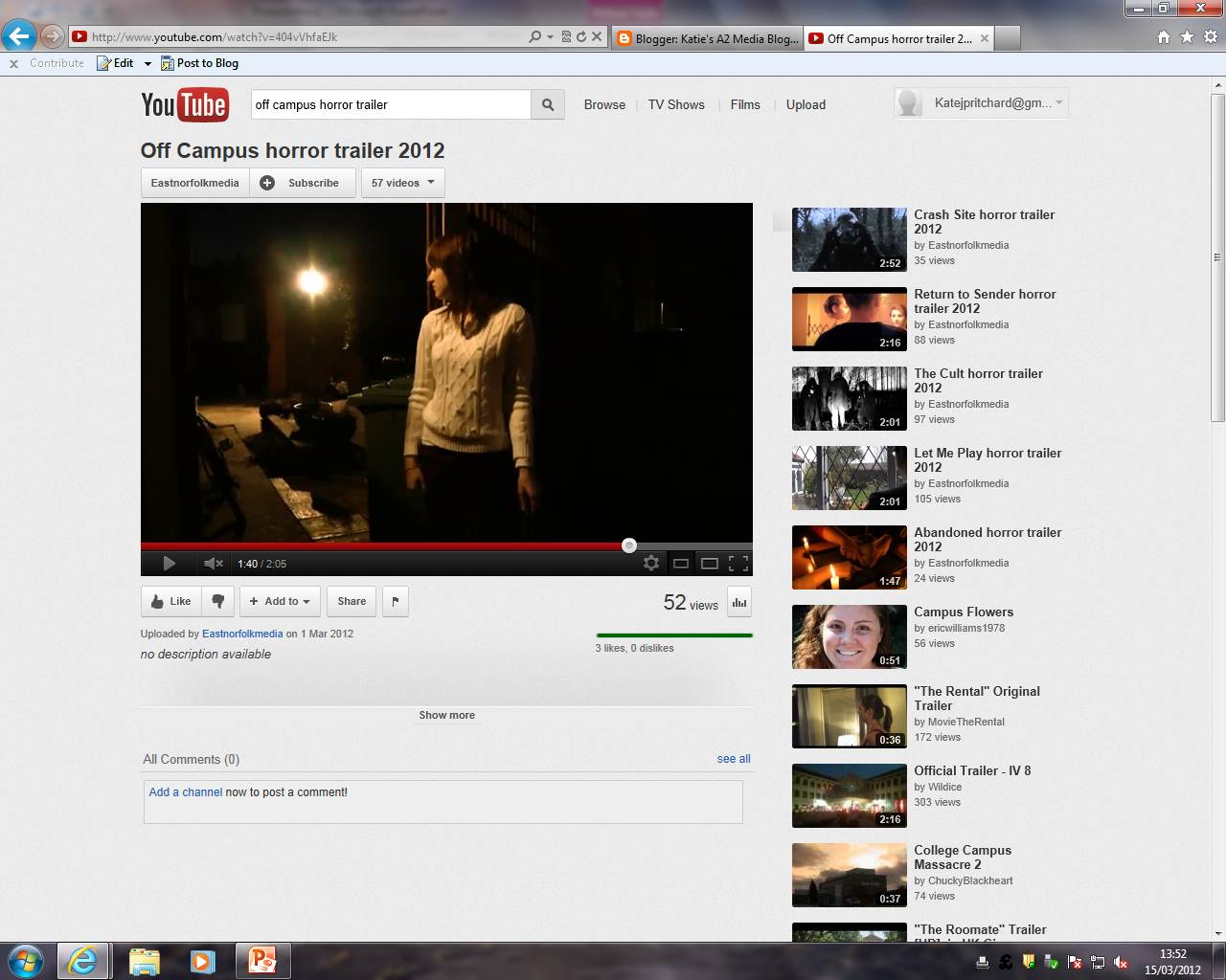


 is a video sharing website in which people can upload videos or just simply watch them. After completing my trailer it was then uploaded to YouTube so that I could then link it to my blog and also access it from any location. YouTube also helped in my planning and research because I was able to watch other trailers to look for conventions and to gain inspiration. Although a convenient method of linking videos to my blog I found that when trying to take stills from it many adverts appeared or whilst full screen it did not buffer properly.


Final Cut Pro was the programme that we used to edit our trailer. From this we could produce special effects, edit shots, create transitions and generally create an interesting product that is conventional of a horror trailer. However, I found this programme to be quite difficult to use and so our trailer could have suffered due to our lack of experience using the software. Also, it is only available on Apple Mac computers, so any editing had to be done in college in our media classroom, proving difficult for weekends or holidays. To see which tools I used particularly, see the other post under this label. (click here).

Garage band is also a programme that we used on a Mac to produce sound for our trailer. We could then import this sound to the trailer and make sure that it is fitting to the visuals. However, it seemed that when looking for music and templates we could use, it was very time consuming trying to look through all of the options and we spent a lot of wasted time listening to random sound effects. Most of the sound that we actually used in the trailer we downloaded from a free music sharing site, including the sound effects we used which could not be found on the programme.


I found to be a very useful tool in the aid of analysing texts, it allowed me to upload an image and annotate it specifically; giving it labels and annotations to each label. This is something that I definitely preferred to written work as the text became interactive and most likely much more interesting for an audience to read. It was also very easy to attach this to my blog, however the labels only became visible whilst on the Flikr website; this lead to me having to write (click for labels) under each image. This I found to be awkward, and I think it may have been better if Flikr allowed for the labels to show up on Blogger.


The entire point of using a blog as a medium is to show coursework in a more creative way, therefore I found that Slideshare was a great website to use. For things such as my audience research, I was able to create a PowerPoint Presentation, something that displays information such as this in a visual way. I could then upload it to the website Slideshare, and attach this to my blog. You are then able to scroll through the presentation on your blog, and it becomes a more interesting way to present data. However, in one presentation I uploaded, I found that Slideshare uploaded the slideshow and changed the colour scheme. Meaning that you could no longer see the text and so I had to change the colour of it. I'm not sure why it did this, but it was something I found strange whilst using the site.


In order to physically film our trailer and create my ancillary tasks it was important to use camera equipment, we needed a tri-pod, a camera and lighting to create a product that looked professional. The cameras that we used were capable of filming in full HD quality, and so my trailer is available to watch in full 1080p if you have the broadband capacity to buffer it. There was not much that I could fault with the equipment it's self, most of it worked efficiently and dealt with the task well.

To create my ancillary tasks, I needed to use Photoshop. Photoshop is software with many uses, what I used it for was to create a film magazine and also a film poster for my trailer. Since last year I have learnt well how to use Photoshop, and the fact that in AS level I spent many months creating a magazine cover and just a week and a half in A2; shows that I have made progress developing my skills in this software. Photoshop is a good tool of creating texts if you know how to use it, but similarly to Final Cut Pro if you don't know how to use it your work can really suffer.


Overall I have used a lot of technology in order to complete my coursework, some of it I enjoyed using and found to be an effective way of producing work. Some I found to be rather difficult and that lacked customisation.

Sunday 11 March 2012

In what ways does your media product use develop or challenge forms and conventions of real media products?

I think that my trailer contains many elements that are conventional of the horror genre, aspects such as the shot types, mise-en-scene and sound were all used to create a product that would represent the horror genre in a way that also represents the ideas and narrative that we had for our own horror film.

For example, horror tends to use lighting as a feature to cause feelings such as disorientation and fear to give the product a certain connotation. Such as in the film 'Orphan', the high key lighting below is used to imply a medical facility; it lasts only a few seconds which assists the disorientation that the audience feel. It appears as a point of view shot which puts us in the eyes of the character and we can relate to them, looking into a light is not only disorientating but it also allows for something to happen that is not comprehensible. Similarly to this, my trailer contains also a shot (below) that is designed to disorientate the audience and also lasts only a couple of seconds, however my shot uses more low key lighting to darken the scene and connote mystery; it coincides with the change of music to show that the characters are in danger, and the fact that it is difficult to see what is going on makes it even scarier. The differences between these shots are quite obvious, from 'Orphan' the lights appear to come from the ceiling and make us think that the person is lying down, making that person seem vulnerable. In 'Off Campus' it is a person holding a torch, which makes it seem more like a discovery of something lurking in the shadows, it is almost the point of view of the killer as we see that the character's are being more wise to it's presence.

 
 'Orphan' screen shot      'Off Campus' screen shot

Another convention of trailers is to concentrate on the interests of the audience, mainly to make the audience interested in watching the film. In horror, trailers tend to concentrate on the fears of it's audience, a common fear that many people share, including myself is a fear of eyes. In 'The Final Destination' there is an extreme close-up of an eye, which is very similar to a shot in my trailer. As shown below.


'Off Campus' screen shot        'The Final Destination' screen shot

As you can see, both shots are very similar, even the way that the eyes are at a canted angle is very similar and shows that both are following conventions of horror. These close-ups of an eye act like the beginning of an eye line match, which allow the audience to identify with a character and also imply that something bad is going to happen. Eyes become the focus of attention at this point so that we can see pupils dilate and even reflections in the eyes of what is to come.
However the differences in these two shots are clear, the eye in my own trailer appears a lot darker and has a darker connotation to it, speculating who the eye belongs to and what intentions that character has. In 'TFD' trailer the eye looks more troubled, and it is made clear in the trailer that the eye belongs to the main character, the weakness here connotes this as the character is helpless and explosions erupt around him. 


A common feature of trailers particularly, is to use titles during the trailer to give additional information about the trailer which the visuals do not give in sufficient detail. Most trailers contain them, each varying in size and fonts to suit the subject of the trailer.

'The Final Destination' screen shot   'Off Campus' screen shot

As you can see above, both trailers contain titles, and oddly enough it even seems that they appear at the same time in the trailer, 'The Final destination' appearing at 1.18 whilst 'Off Campus' appears at 1.15. This suggests that it is conventional of trailers to show these kind of titles around this time, a balance between visuals and text that gives the full story. However, the types of text differ greatly, and this is due to the sub genre of the films. TFD almost has a sci-fi essence to it because it is based on psychological visions, this is represented though the neon blue text and whispery background. But OC is a slasher/paranormal type film and so uses red, which has connotations of blood and death.

Another means of giving away aspects of the story is to use newspaper clippings, not only do they assist titles in giving details about the narrative they are also an aesthetic way of showing them. Newspaper clippings are conventional of both trailers and horror because they support the idea bought forward from the 18th century classic novel 'Dracula' and also give away major aspects of the narrative. The idea that there is life after death; so in terms of the newspapers, the idea that things can reoccur, deaths in certain houses, return of old killers and so forth.

 'The Amityville Horror' screen shot    'Off Campus' screen shot

Both trailers contain headlines which are relevant to the narrative of the film, it is important to do this in order to portray the narrative well. The differences in these shots are that 'TAH' seems to focus on one clear storyline, and a spotlight effect is used to create a more unique feel to it. In 'OC' there are several articles, which in my mind makes it seem more like a developing issue that seems to reoccur. This would support the idea created by the novel Dracula as it represents the idea of things returning.
  
A common convention of trailers involves the use of weapons, a weapon in a film can connote different things and becomes part of the iconography. It also gives information about the type of killer, for example a samurai sword generally connotes a ninja, or a gun connotes a gangster. Particular horror legends have different weapons that become associated with their image, Freddy Kruegar has a glove with blades whilst Jason prefers a machete. Therefore a weapon in a trailer can instantly give details about the kind of killer included in the film. No weapons at all can mean that a film takes a different approach to death, such as religious themed films where exorcisms occur and weapons aren't really needed

 'The Crazies' screen shot   'Off Campus' screen shot

Both of these trailers contain pitchforks; a pitchfork connotes the idea of a farmer, which I think is quite representative of the past. Death by pitchfork would also be rather a gruesome death, which suggests that both films contain a lot of gore. Also they are both shown in the same stabbing motion towards the camera, this is a convention of horror as it puts the audience in the point of view of the person who is being stabbed, something that no audience member would want. However the differences between these shots are vast, the lighting is very different as in 'The crazies' it is a bright clear shot which focuses mainly on the pitchfork. In 'OC' the shot is much darker and is lit using a torch, it does make the audience feel more involved though as they keep their eyes watching as to where the torch shines, in which it highlights the fork as it is coming down. 

Another interesting thing that I found was that in the last shot that we used in 'Off Campus' where the final girl  is in a car and gets grabbed from behind, an almost identical shot was featured in 'The Devil Inside'. The shot is very conventional of horror because it is a jumpy scene which is featured in many classic horrors, it is almost standard whilst watching a film to shout 'check the back seats!' as it is frustrating when a character doesn't and is then captured. 

'The Devil Inside' screen shot       'Off Campus' screen shot

The main differences between these shots are the shot distance 'TDI' being a medium shot, whilst 'OC' is a long shot, the fact that in 'TDI' the killer is much more noticeable and easier to identify, but the long shot makes it seem more mysterious, and in both trailers the fate of the character is left unknown. Also the lighting is much darker in 'OC' which adds to the mysterious quality of the ending, what happens to the final girl is left undetermined.  

The use of effective shots in a trailer are very important, they have a great impact on the audience and also help to gain their interest.

'The Crazies' screen shot    'Off Campus' screen shot

These dramatic shots are very similar in terms of lighting, the outline of them is lit in a way that their torso appears like it is glowing. Obviously the location of these shots are very different, in my own trailer it is a character entering a shed, whilst in 'The Crazies' it seems more like a discovery, especially as the audience's eyes are drawn to the large unidentifiable object. Both however are still dramatic shots that cause impact on the audience, they are interesting and attract attention

Another important factor of horror is gore. The amount and type of gore is mostly due to preference, but in many films gore is included as a means of attracting it's audience

'Smiley' screen shot       'Off Campus' screen shot 

One way of portraying gore is by showing the source of the gore, the method that lead to the gory scene. The feeling that the audience get when seeing a bloody knife for example is they imagine the motion of stabbing that would lead to the knife being bloody. For people who do not like blood this can be very scary. 

An important aspect of any trailer/film is to identify the location that the film is set in, it is important for an audience to know the location of the film as this allows for the audience to have a general better understanding of a film. The setting plays an important part of mise-en-scene as it allows for other assumptions about the film to be made which help an audience establish important things such as the plot. For example if a film is set in a mental hospital, the film is likely to be about a psychotic  patient who may return and kill who ever is there. 

 'Last House on the Left' screen shot  'Off Campus' screen shot

Both of these trailers contain shots of cars, although not straight away an indication of the setting, they do give away the fact that the characters had to travel to get there. In 'LHONL' it acts as an establishing shot which does give away many aspects of the location. In my trailer, a long shot is used and this does still successfully give away that it is in a residental area. Both shots are used for different purposes, in my own trailer the car is used as a means of moving house, whilst the other is used to travel away on holiday

Overall I think that my trailer contains many conventions that a real trailer does, the genre of the trailer is made clear by the low key lighting, the expressive non-naturalistic camera work, and the use of mise-en-scene. The name of the film is indicated clearly at the end of the trailer with a memorable sound effect, and also at the end of the trailer are production values such as the stars and directors.

What have you learnt from your audience feedback?

Monday 20 February 2012

Film poster analysis

Film poster analysis by katejane1
Film poster analysis, a photo by katejane1 on Flickr.
I loved the striking image on this poster which attracted me instantly as I found it creepy. (click for annotations).

Film magazine cover analysis

Film magazine cover analysis by katejane1
Film magazine cover analysis, a photo by katejane1 on Flickr.
Click image for annotations

Film magazine cover analysis

Film magazine cover analysis by katejane1
Film magazine cover analysis, a photo by katejane1 on Flickr.
This is an analysis of a magazine cover that I did in order to gain knowledge on the conventions of film magazines to make the process of creating my own magazine a relatively easy one. (Click image for annotations).

Wednesday 7 December 2011

Representation of Women in Horror


Carol Clover, in men, women and chainsaws argues that horror’s representation of gender is very interesting because it frequently offers its core target audience of young males an identification with a female character, unlike any other mainstream genre. To what extent do you think horror’s representation of gender challenges dominant representations?

In the media, gender has been typically represented in a certain way for many years, only in recent years has this dominant ideology and conventional representations been challenged by progressive media products. Males and females are stereotyped; males often shown as dominant, strong and heroic as opposed to females who are often objectified and shown as a weaker sex in general.  
Jeremy Tunstall argues that female roles in the media are categorised into four main areas:
domestic              sexual                consumer                marital

He argues that any woman in the media will fit into one of these categories, usually shown through their relationship to men, (e.g. wife, mother), as a sex object, an eager consumer or a housewife, but a male is rarely shown in any of these forms.
                 
The visibility of women in the media is also limited in comparison to men, in a study conducted in 1992 a ratio of 2:1 males to females was found; showing that men are much more common in the media, there are also certain types of females that are rarely represented such as black women or homosexual women. 


Laura Mulvey suggests that commercial cinema puts its audience in the eyes of an appraising heterosexual male through the use of camera techniques creating something known as the ‘male gaze’. It uses ‘sadistic objectification’ to show women as objects rather than people, and allow males to become subjects who enjoy the view; it denies women’s rights to their own subjectivity. Camera techniques used include long shots of the female; tilting up the body and fragmenting it into different parts and also using close-ups and POV shots of the male in order for the audience to connect and be able to relate to him. Theorists including Mulvey argue that this is a sexist viewing and denies women their right to subjectivity by controlling them and showing them only as objects.
                 

However, if this male gaze is true in mainstream cinema would that not isolate particular audiences, such as women and homosexual males? Others also suggest that women look at themselves through a male gaze and see themselves as what a male would, the male gaze has become internalised and part of their self identity.


                In Carol Clovers book ‘Men, Women and Chainsaws’ she discusses many films, in particular one named ‘Carrie’ in which a shy high school student is bullied by her peers and when her period begins she gains a telekinetic power and enforces revenge on her bullies. Predominantly the target audience for horror movies are 17-24 year old males and so an interesting point arises about the film ‘Carrie’ which has a very feminine narrative. How can young males relate to a female character such as this one, who gains inner strength from her menstrual period and uses it as a revenge strategy against her bullies?

Stephen King, (author of the book) states that ‘Carrie’s revenge is something that any student who has ever had his gym shorts pulled down in Phys Ed or his glasses thumb-rubbed in study hall could approve of’ as an explanation of both the film and books success. Despite the use of ‘any student’ in this quote he continues to explain using the pronoun ‘his’ and describing having glasses ‘thumb-rubbed’ which is an unusual activity for any females to do to each other or in fact for males to do to females. But what he is trying to suggest is in fact that a boy can recognise himself in a girl, and that males are prepared to identify with a vulnerable female character in horror due to their own experiences in which they were also vulnerable. Quite contrasting in terms of action movies where males can identify with action heroes who are represented as strong, heterosexual and brave. This is one of the reasons that the horror genre is so different to most, the fact that males identify with vulnerable females, suggesting a more progressive nature in terms of the representation of women but also leading to many theorists wondering why this works so well.

Thus Carol Clover’s final girl theory exists, the idea that in most horror films a target audience of young males can identify with a vulnerable female who in the end defeats the killer and survives. The final girl is often virginal and androgynous, this seeming to be the reason behind her survival compared to other female characters in horror who are usually represented sexually. For example in the film Halloween (1978), the protagonist who survives is Laurie, an innocent, intelligent and sensible character as opposed to her friends Annie and Linda who are objectified and thus murdered early on.  Despite this representation director John Carpenter denies that this is true, jokingly saying that ‘I didn’t mean to put an end to the sexual revolution!” and pointing out that characters such as Linda and Annie died because they were distracted and not paying attention. Laurie and other ‘final girl’ characters are a masochistic identification, meaning that the audience identifies with them rather than just seeing them as objects they become the subjects.

In my research I looked at many factors in horror movies such as visibility, roles, gaze and narrative in order to address these arguments and to help determine whether horror is a progressive genre or not. The films I looked at were Halloween (1978), The Shining (1982) and Eden Lake (2008). In terms of visibility I found that two of the films I watched included more males than females, Halloween however contained a ratio of 6:7 females to males, roughly equal numbers and going against the 1992 research which found more males than females represented in the media. This could suggest that Horror is a progressive genre, however Halloween is the oldest film in my sample and the other two contained ratios of 4:8 and 6:11 of females to males, suggesting that in fact horror is not progressive, especially as the 6:11 ratio belonged to the most recent film in my sample; Eden Lake.


When it came to roles represented in horror, I discovered that interestingly although all three films contained the roles specified by Tunstall they also contained female protagonists that did not fit into these roles as such. I found it hard therefore to argue whether horror was indeed progressive or not in relation to roles, as my results did not substantially support or disprove this idea. In Halloween, both domestic and sexual objects were represented by the characters but the fact that Laurie was the final girl I thought balanced the argument although Laurie did obtain a slightly domestic role whilst babysitting, I thought that the fact she stopped the killer outweighed this. In The Shining the female roles represented included domestic, sexual, (the bath tub woman), and familial. However Wendy, whose roles included both domestic and familial became the final girl and even takes over her husband’s job when he becomes ill, which in fact shows her in a progressive light.  In Eden Lake the roles shown were mainly domestic and familial, although a female gang member also seemed to have a rather passive role in the gang which supports Tunstall’s theories. Even Jenny, the final girl and female protagonist has a domestic role associated to her in relation to her career. But she does become increasingly monstrous in the film to combat her enemies which does support the idea that horror is progressive.

When it comes to the ‘male gaze’ I did find some evidence of this in the films that I watched, for example in Eden Lake the gang looked at Jenny, (the protagonist) through a male gaze, but this gaze is undermined through the use of close ups of Jenny which makes her the subject and allows us the audience to identify with her and feel her disgust at the gang. This goes against theories put forward by Mulvey. In The Shining, the naked bath tub woman is objectified, but this gaze is also undermined by her transformation to an old woman. It almost punishes the audience for looking at this character in that way by changing her into something that they would not like to see. When it comes to Halloween the male gaze is used frequently through Michael’s point of view; characters Annie, Linda and Judith are looked at objectively. However, Laurie is not objectified and later on becomes the subject of the film; we are increasingly put into her perspective. In terms of the male gaze I would say that horror is progressive, with exceptions to the film Halloween the others did display the male gaze but in both cases was undermined through the ability to identify with the female protagonists. Even with Halloween the fact that Laurie was not objectified could arguably be enough to say that it is indeed progressive too.


And finally narrative, to investigate this I decided to count how many deaths there were in each film and compare the number of males compared to females to see if females were punished particularly more than males. Mostly in horror films the idea is that females get punished for transgressing male rules involving sexuality and how men should be in control. Generally I found that in fact females were not significantly punished more than males were, in some cases the death counts were equal such as in The Shining. In Halloween the female deaths were slightly higher, a 60% female and 40% male ratio existed but this percentage isn’t overly higher than the males and was probably due to the fact that there were more female than male characters anyway. Eden Lake also showed roughly equal death counts and therefore suggests that horror is a progressive genre.

Overall, horror shows progressive qualities such as the narrative and male gaze but it does also contain aspects of traditional representations of gender. Each film did support the idea of a final girl character, showing masochistic identification but it did also show typical representations of female roles such as domestic and sexual roles. The male gaze in horror appears to be something that undermines its effectiveness and almost punishes those who participate in it. In conclusion I personally think that horror is a progressive genre, although it may contain aspects of typical female roles it also allows the audience to identify with a female protagonist and does not represent her in any stereotypical way, and isn’t the main character and her story the part the audience focus on and become involved in anyway?